Rss Feed Like Us on facebook Google Plus
Showing posts with label html5. Show all posts

June 19, 2014

Accordion with Jquery Toggle

Accordion Displays Collapsible Content on very less space. I am going to give a demo of  accordion using JQuery Toggle.

You can achieve this also by using bootstrap. to see an advance version you can checkout CSS Tricks Website.


DEMO


Lorem Ipsum 1+
Lorem Ipsum 2+
Lorem Ipsum 3+

Code

<html>
<head>
<style>
.accordion_container {
    width: 500px;
}
.accordion_head
{
    background: linear-gradient(0deg, #F79711, #DC7E03) repeat scroll 0 0 #D07906;
    color: white;
    cursor: pointer;
    font-family: segoe ui;
    font-size: 15px;
    margin: 0 0 1px 0;
    padding: 7px 11px;
    font-weight: bold;
    background-color: #D07906;
}
 
.accordion_body h3
{
    background-color: #CCCCCC;
    font-size: 20px;
    font-variant: small-caps;
    margin: 0;
    padding: 5px;
}
.accordion_body a.anchorButton
{
    font-size: 14px;
    padding: 2px 15px;
    float: right;
    width: auto;
    height: auto;
}
.accordion_body
{
    background: #f1f1f1;
}
.accordion_body p
{
    padding: 8px;
    margin: 0px;
}
.plusminus
{
    float: right;
}
</style>
<script src="https://ajax.googleapis.com/ajax/libs/jquery/1.8.1/jquery.min.js"></script>
<script>
$(document).ready(function(){
    //toggle the componenet with class accordion_body
    $(".accordion_head").click(function(){
        if ($('.accordion_body').is(':visible')) {
            $(".accordion_body").slideUp(600);
            $(".plusminus").text('+');
        }
        $(this).next(".accordion_body").slideDown(600);
        $(this).children(".plusminus").text('-');
    });
});
</script>
</head>
    <div class="accordion_container">
        <div class="accordion_head">Lorem Ipsum 1<span class="plusminus">+</span></div>
            <div class="accordion_body" style="display: none;">
            <p>Lorem Ipsum 1 is simply dummy text of the printing and typesetting industry. Lorem Ipsum has been the industry's standard dummy text ever since the 1500s, when an unknown printer took a galley of type and scrambled it to make a type specimen book. </p>
            </div>
        <div class="accordion_head">Lorem Ipsum 2<span class="plusminus">+</span></div>
            <div class="accordion_body" style="display: none;">
            <p>Lorem Ipsum 2 .It has survived not only five centuries, but also the leap into electronic typesetting, remaining essentially unchanged. It was popularised in the 1960s with the release of Letraset sheets containing Lorem Ipsum passages, and more recently with desktop publishing software like Aldus PageMaker including versions of Lorem Ipsum.</p>
            </div>
        <div class="accordion_head">Lorem Ipsum 3<span class="plusminus">+</span></div>
            <div class="accordion_body" style="display: none;">
            <p>Lorem Ipsum 3 is simply dummy text of the printing and typesetting industry. Lorem Ipsum has been the industry's standard dummy text ever since the 1500s, when an unknown printer took a galley of type and scrambled it to make a type specimen book.   </p>
            </div>
 
    </div>
</html>


Read More

February 20, 2014

Style your button with transform and transition : CSS3

Style up your button with CSS3 transitions and transform. i'm going to give a demo to use these properties. below some basic information of Transition and Transform
Transform :
The transform property applies a 2D or 3D transformation to an element. This property allows you to rotate, scale, move, skew, etc., elements.

transform: none|transform-functions|initial|inherit;

Transition :
CSS3 transitions are effects that let an element gradually change from one style to another.
To do this, you must specify two things:
  • Specify the CSS property you want to add an effect to
  • Specify the duration of the effect.
transition: all 1s ease-in-out;

Example with a Button


HTML :
<div>
 <button type="button" class="btn-effect">Submit</button>
</div>
CSS :
.btn-effect:before {
    background: none repeat scroll 0 0 #66B3F6;
    content: "";
    height: 100%;
    left: 0;
    position: absolute;
    top: 0;
    width: 100%;
    z-index: -1;
    color: #fff;
}
.btn-effect:after {
    background: none repeat scroll 0 0 #BFE1FB;
    content: "";
    height: 0;
    left: 50%;
    opacity: 0;
    position: absolute;
    top: 50%;
    transform: translateX(0%) translateY(-25%) rotate(45deg);
    -webkit-transform: translateX(0%) translateY(-25%) rotate(45deg);
    transition: all 0.3s ease 0s;
   -webkit-transition: all 0.3s ease 0s;
    width: 100%;
    z-index: -1;
    border: 1px solid #f4f4f4;
    left: 0;
    top: 0;
}
.btn-effect {
    border: 0.5px solid #f4f4f4;
    color: #fff;
    cursor: pointer;
    font-family: segoe ui;
    font-size: 18px;
    height: 45px;
    line-height: 18px;
    padding: 10px 40px;
    position: relative;
    font-variant: small-caps;
    transition: all 0.5s ease-in-out 0s;
    box-shadow: 1px 3px 5px 1px #aaa;
    font-size: 22px;
    overflow: hidden;
    z-index: 99;
  border-radius:5px;
}
.btn-effect:hover, .btn-effect:active {
    color: #000000 !important;
}
.btn-effect:hover:after {
    height: 215%;
    opacity: 1;
    width: 100%;
}
.btn-effect:active:after {
    height: 235%;
    opacity: 1;
}

LIVE DEMO :


Read More

September 26, 2013

use editable controls with contenteditable attribute - HTML5

There are various technologies available to edit text and store in web browser, but using contenteditable attribute (HTML5) is too easy to make any control editable in a web page.

The contenteditable attribute is an enumerated attribute whose keywords are the empty string, true, and false. The empty string and the true keyword map to the true state. The false keyword maps to the false state. In addition, there is a third state, the inherit state, which is the missing value default (and the invalid value default).

SYNTAX

element . contentEditable [ = value ]


Returns "true", "false", or "inherit", based on the state of the contenteditable attribute.
Can be set, to change that state.
Throws a SyntaxError exception if the new value isn't one of those strings.
element . isContentEditable
Returns true if the element is editable; otherwise, returns false.
The contenteditable attribute was mainly intended for providing an in-browser rich-text or WYSIWYG experience. You’ve likely seen this sort of thing in blog-based authoring tools like Symphony or sites like Flickr where you can begin editing page content simply by clicking in a given area.


As mentioned above, contenteditable has three possible states:
contenteditable="" or contenteditable="true"
Indicates that the element is editable.
contenteditable="false"
Indicates that the element is not editable.
contenteditable="inherit"
Indicates that the element is editable if its immediate parent element is editable. This is the default value.
When you add contenteditable to an element, the browser will make that element editable. In addition, any children of that element will also become editable unless the child elements are explicitly contenteditable="false".

Code Example 
Here’s some example code to get us started:
<div id="example-one" contenteditable="true">
<style scoped>
  #example-one { margin-bottom: 10px; }
  [contenteditable="true"] { padding: 10px; outline:2px dashed #CCC; }
  [contenteditable="true"]:hover { outline: 2px dashed#0090D2; }
</style>
<p>Everything contained within this div is editable in browsers that support <code>HTML 5</code>. Go on, give it a try: click it and start typing. Tech Impulsion</p>
</div>

LIVE EXAMPLE.


Everything contained within this div is editable in browsers that support HTML 5. Go on, give it a try: click it and start typing. Tech Impulsion


Read More

September 4, 2013

Semantics : HTML5 Features

Semantics is one of the most distinctive features of the Web Platform versus other application platforms. Developers usually ignore or de-prioritize such feature but the mastery of it can bring many benefits to our projects.

The Web is text and text has a meaning. Ultimately the content that our browsers read is pure text. Web sites and web applications have been created in an ecosystem where text based content is linkable, searchable and mashable. In the open web scenario our content can be shown, fed and remixed by third parties, search engines and accessibility tools. All these benefits don't come for free. 

Automated tools can only do half of the job at recognizing the nature of the content. The better job the developer does at marking the right semantics of the content the easier will be for the rest of the agents to deal with it. HTML5 provides a series of tools to make developers life easier too:
  • New media elements.
  • New structural elements.
  • New semantics for internationalization.
  • New link relation types.
  • New attributes.
  • New form types.
  • New microdata syntax for additional semantics.

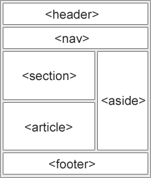
New Semantic Elements in HTML5

Many of existing web sites today contains HTML code like this: <div id="nav">, <div class="header">, or <div id="footer">, to indicate navigation links, header, and footer.

HTML5 offers new semantic elements to clearly define different parts of a web page:
  • <header>
  • <nav>
  • <section>
  • <article>
  • <aside>
  • <figcaption>
  • <figure>
  • <footer>


HTML5 <section> Element

The <section> element defines a section in a document.
According to W3C,  "A section is a thematic grouping of content, typically with a heading."

Example:
<section>
  <h1>TECH IMPULSION</h1>
  <p>"A Comprehensive technology blog with great articles."</p>
</section>


HTML5 <article> Element

The <article> element specifies independent, self-contained content.

"An article should make sense on its own and it should be possible to distribute it independently from the rest of the web site."

Examples of where an <article> element can be used:

  •     Forum post
  •     Blog post
  •     News story
  •     Comment

Example:
<article>
  <h1>Microsoft Launches Internet Explorer 10</h1>
  <p>Windows Internet Explorer 10 (abbreviated as IE10) was released to
  the  public by Microsoft.....</p>
</article>

HTML5 <nav> Element

The <nav> element defines a set of navigation links.

"The <nav> element is intended for large blocks of navigation links. However, not all links in a document should be inside a <nav> element!"


Example:
<nav>
<a href="/html/">HTML</a> |
<a href="/css/">CSS</a> |
<a href="/js/">JavaScript</a> |
<a href="/jquery/">jQuery</a>
</nav>

HTML5 <aside> Element

"The <aside> element defines some content aside from the content it is placed in (like a sidebar)."

The aside content should be related to the surrounding content.


Example:
<p>My family and I visited The Epcot center this summer.</p>
 
<aside>
  <h4>Epcot Center</h4>
  <p>The Epcot Center is a theme park in Disney World, Florida.</p>
</aside>

HTML5 <header> Element

The <header> element specifies a header for a document or section.

"The <header> element should be used as a container for introductory content."

You can have several <header> elements in one document.

The following example defines a header for an article:

Example:
<article>
  <header>
    <h1>Internet Explorer 9</h1>
    <p><time pubdate datetime="2011-03-15"></time></p>
  </header>
  <p>Windows Internet Explorer 9 (abbreviated as IE9) was released to
  the  public on March 14, 2011 at 21:00 PDT.....</p>
</article>

HTML5 <footer> Element

The <footer> element specifies a footer for a document or section.

A <footer> element should contain information about its containing element.

"A footer typically contains the author of the document, copyright information, links to terms of use, contact information, etc."

You can have several <footer> elements in one document.

Example:
<footer>
  <p>Posted by: Azziet Singh</p>
  <p><time pubdate datetime="2012-03-01"></time></p>
</footer>

HTML5 <figure> and <figcaption> Elements

"The <figure> tag specifies self-contained content, like illustrations, diagrams, photos, code listings, etc."

While the content of the <figure> element is related to the main flow, its position is independent of the main flow, and if removed it should not affect the flow of the document.

The <figcaption> tag defines a caption for a <figure> element.

The <figcaption> element can be placed as the first or last child of the <figure> element.

Example:
<figure>
  <img src="img_pulpit.jpg" alt="The Pulpit Rock" width="304" height="228">
  <figcaption>Fig1. - The Pulpit Pock, Norway.</figcaption>
</figure>


Read More

© 2011-2016 Techimpulsion All Rights Reserved.


The content is copyrighted to Tech Impulsion and may not be reproduced on other websites.